Ruter
Designing the future of mobility.We’ve been working closely with Ruter, the public transport provider of the greater Oslo area, on their newly released app, simplifying their digital products, reestablishing their brand, and looking into the future of mobility for millions of Norwegians.
What we did
- Digital strategy and user testing
- Product and UX design
- Custom type
- Motion design
- Scalable cross-platform design system
Building a seamless digital experience for tomorrow’s city dwellers
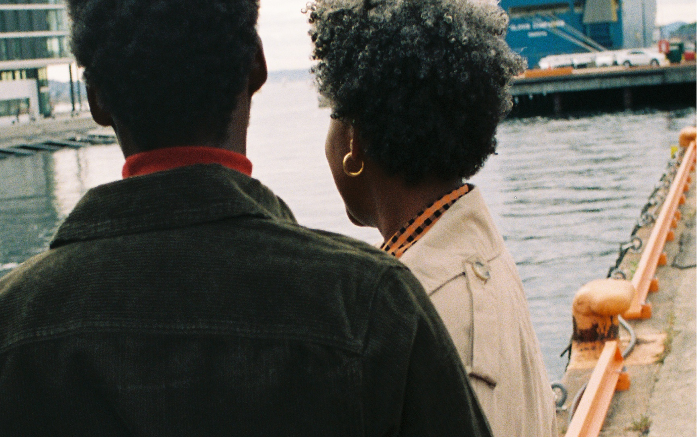
The landscape of public transportation and urban mobility is rapidly changing. To keep up with this trend, Ruter has to meet the needs of a new generation of travellers. Today’s city dwellers demand the simplicity to move around freely, expecting the digital products that guide them through the city to be seamless and frictionless at all times.
We worked with Ruter to provide all travellers with a personalised and accessible digital experience, connecting them to the city in novel ways. Through intuitive design solutions we explored how to offer extensive travel options for a wide range of users, making it easier to“unlock the city” on multiple levels.
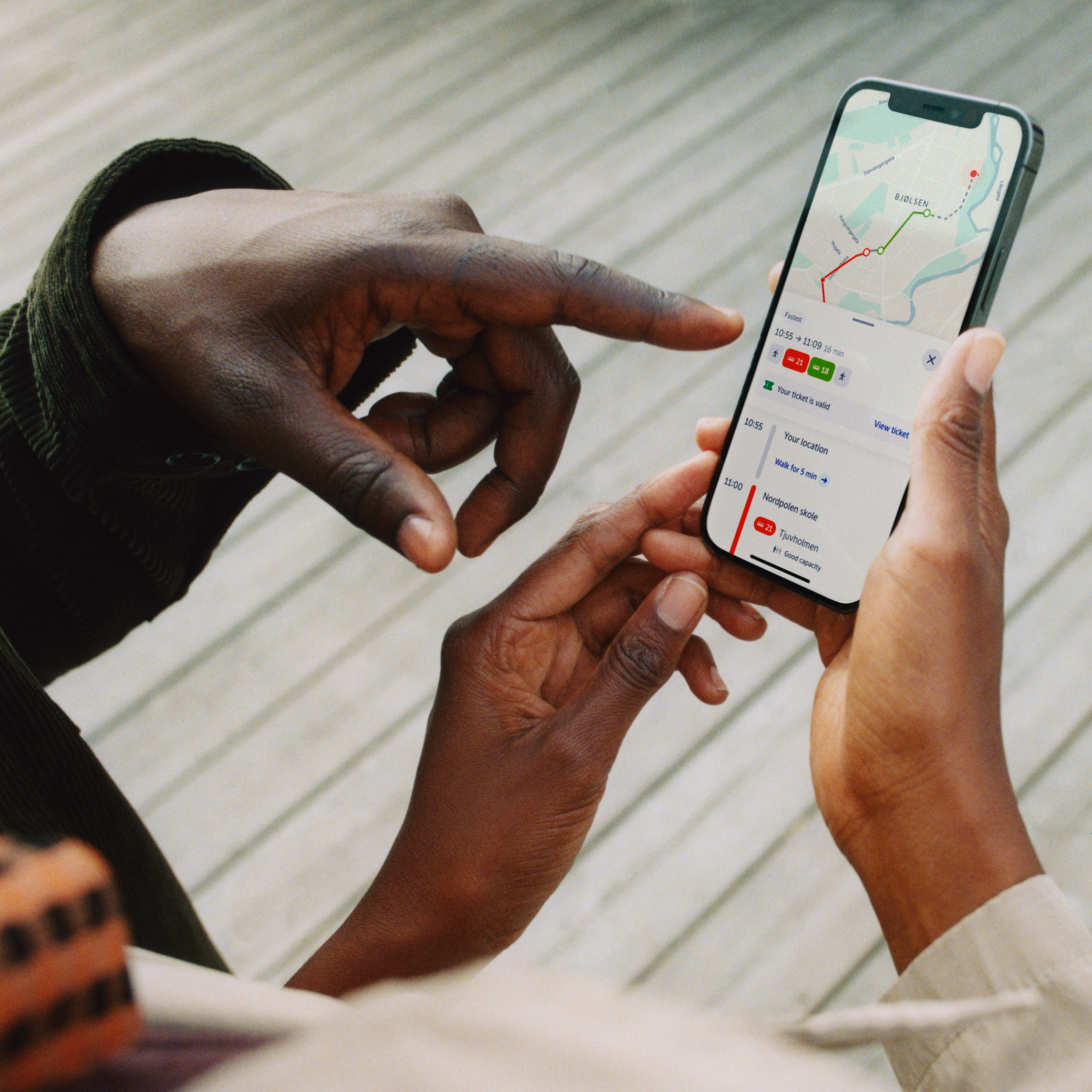
In case you find yourself on unfamiliar grounds, the integrated map accurately leads you to the nearest transit point, giving a clear overview of the bigger picture.
One app for all travels and modes of transportation
With almost two million people using Ruter’s digital platforms on a daily basis, the need for a robust and scalable solution has been pressing. The functionality of previous apps was limited, with important features scattered across multiple services. Our goal was to make the users’ everyday lives a bit simpler, keeping in mind that the city and its population are continuously growing and changing.
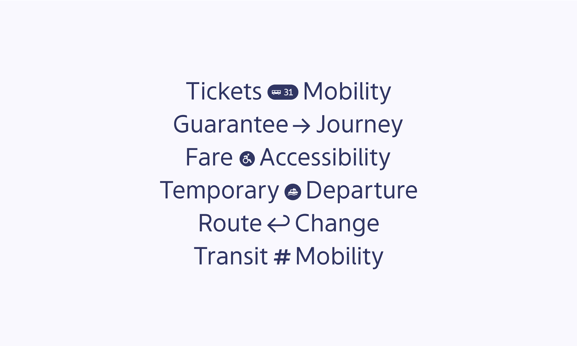
We gathered Ruter’s key digital features — journey planning and ticket sales — in one app, implementing a new design system that can scale to future unknowns and new means of transportation, including scooters and city bikes. In addition, we experimented with features that could incentivise cycling and walking: locating the nearest city bike available, rewarding strollers with points redeemable for free rides.
A personalised experience based on live data and tested prototypes
While designing the app, we considered numerous use-cases and contexts, while incorporating large amounts of live data. Our design system had to be implemented across the entire digital platform, including the website and GPS-triggered digital signage in buses. We collaborated with the Ruter research lab to conduct focused testing, and spent time on the street for guerrilla testing with a wide range of travellers.
Based on insights from numerous tested prototypes, we designed an app that enables you to set up a personal profile on which you can save your home address, see frequently used travel routes, and filter transportation modes. We combined the personal travel options with an easy-to-use ticket service, which keeps track of all your purchases and gently reminds you to renew your tickets before they expire.
We focused on real-time engagement with users to make relevant information such as weather reports and traffic updates more accessible, wherever you are.
A refreshed brand identity and bespoke typography
While making the shift to one app, we designed a more consistent brand platform that could encompass all digital touch points. Although Ruter has a well-liked, solid identity, its underlying system had to be more dynamic and flexible to be future-proof.
Our brand team introduced additional colours to complement the recognisable Ruter red, developed a set of illustrations that give the user experience a playful edge, designed a custom typeface and made alterations to the logo mark to improve legibility on mobile screens.
Motion design and iconography form the heart of the app, enhancing the usability of the product throughout.
An extensive design system for an everyday app
Supporting the brand values, we outlined specific motion design principles, making sure duration, ease, effect, and usage are consistent throughout. Animation is no longer just an aesthetic delight, but forms one of the most important and effective tools for a successful interaction between Ruter and the many people they serve.
We delivered a thorough design system to Ruter’s internal design team, which documented everything from typography sizes to animation principles. The app is currently in use by millions of people.
yearly travels
active app users
design awards won
“The app is clearly the result of good design management, resulting in a friendly and warm product. Underneath the surface, however, hides the intricate coding that manages to capture the whole of Ruter’s complex services in an intuitive and attractive interface.”DOGA AWARD
Collaborators
- Sophie Klock (photography)
- Cécile Gariepy (illustrations)